ETF Dashboard
This project is a dashboard built to keep track of ETF trades at a glance.
ETF Traders
B2B applications, Financial Application, Data Visualization, Dark Mode, Web
2025
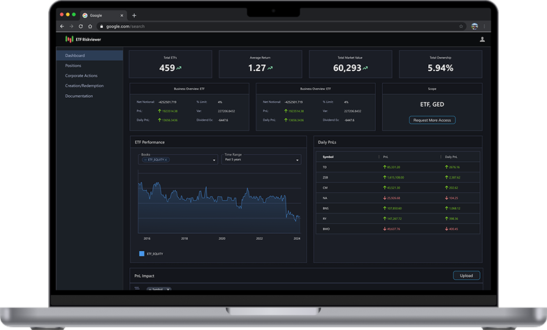
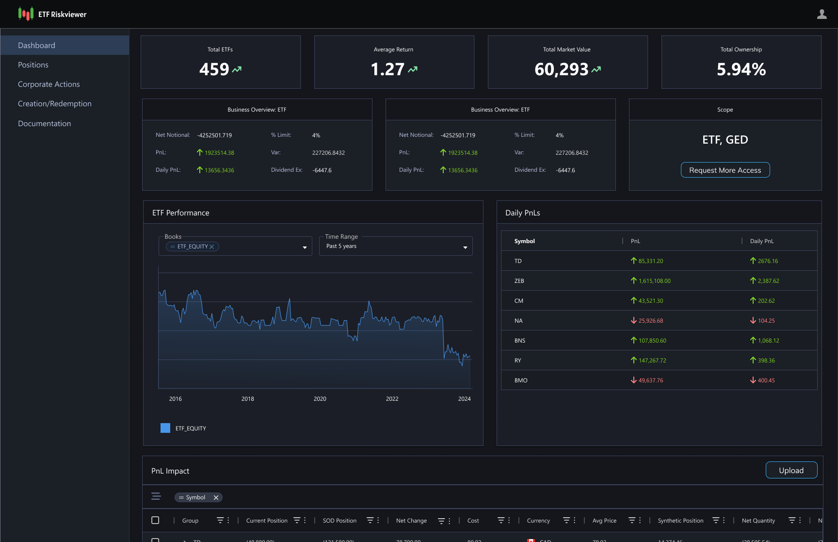
This project is an internal dashboard designed to help trading and sales teams monitor ETF trades at a glance in a fast-moving, regulated environment. It consolidates key metrics such as market risk, portfolio risk, PnL, and trader performance, all while enabling users to quickly review portfolio health without switching between multiple systems.
This iteration was designed under significant constraints. As I did not have prior domain expertise in ETF trading, the intended approach was to collaborate closely with subject matter experts and end users. However, access to both was not available within the required timeframe, while a stakeholder review was already scheduled.
As a result, the design was developed without direct SME or user input and needed to be ready for stakeholder discussion despite these limitations.
In the absence of direct SME and user input, the primary challenge was determining which data and metrics were most relevant to surface. To inform this, I triangulated across multiple inputs:
Internal reference products:
I reviewed existing trading applications within Scotiabank to understand established patterns, commonly surfaced metrics, and internal expectations for financial tooling.
External market research:
I analyzed publicly available ETF and portfolio monitoring dashboards to identify ETF-specific metrics and conventions commonly used in similar contexts.
Initial requirements:
I incorporated the early guidance provided around PnL impact and performance visibility.
Exploratory ideation:
I used structured brainstorming to expand the metric space and pressure-test which data points might be relevant for an at-a-glance dashboard.
As part of early ideation, I used ChatGPT to help enumerate and sanity-check which high-level metrics are typically surfaced most prominently in ETF monitoring contexts. This exercise highlighted total ETFs, average return, total market value, and total ownership as the most relevant summary metrics to display upfront.
Based on this, the top row of the dashboard focuses on these core values. Each metric includes a directional indicator to show movement since the last refresh, allowing users to quickly identify changes without needing additional interpretation. The intent was to provide a clean, no-frills summary layer optimized for fast scanning in time-sensitive workflows.
This summary view is followed by more detailed components, including an ETF performance chart, daily PnL, and a PnL impact table, enabling users to move from high-level signals to supporting detail within a single screen.
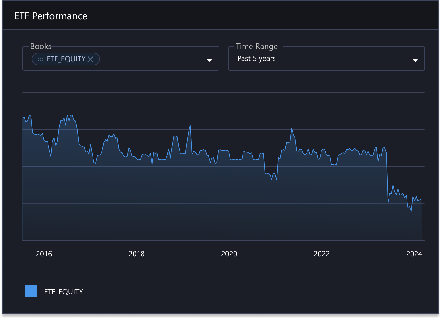
The ETF performance chart was informed by external market research, which showed similar time-series performance views as a common pattern in trading and portfolio monitoring applications.
Based on this, the chart was designed to show how a book performs over a selected time range, while remaining compact and easy to interpret.
Chip-based controls allow users to compare multiple ETFs side by side without introducing additional configuration or navigation. This approach supports quick trend analysis while keeping interaction complexity low, aligning with the dashboard’s at-a-glance intent.
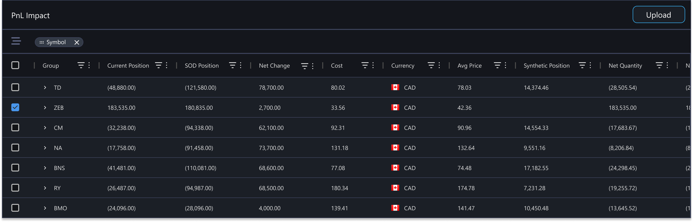
The PnL impact table was designed to replace an existing legacy tool while expanding users’ ability to search, sort, and compare data. Functional requirements such as column sorting, filtering, and comparison were informed by patterns observed in existing internal trading applications, as well as the initial requirement to migrate this workflow out of the legacy system.
Based on these requirements and discussions with the development team, the table was implemented using AG Grid, a high-performance data grid library used across multiple internal applications. Leveraging AG Grid’s built-in capabilities enabled advanced filtering and customization while keeping implementation efficient, particularly given the team’s existing license and familiarity with the framework.
The initial design was reviewed in a stakeholder meeting and received strong engagement, helping establish early alignment on the overall direction. It proved particularly effective as a conversation starter, enabling more concrete discussions around scope, priorities, and feasibility, and served as a foundation for subsequent iterations.
It’s important to note that this version represented an early proof of concept, produced with minimal requirements and without direct user validation. As the project progressed and more inputs became available, the design evolved significantly to reflect refined requirements and production constraints. The final version, informed by deeper collaboration and validation, was launched in Summer 2025.