Aquaculture Analytics Dashboard
Quick Overview
| What is it? | Analytics Dashboard to track the performance of Fish Farms |
|---|---|
| Target Audience | Fish Farmers |
| Who worked with me? | 1 Developer |
| Interesting stuff I worked in | Data visualization, User Research, B2C applications |
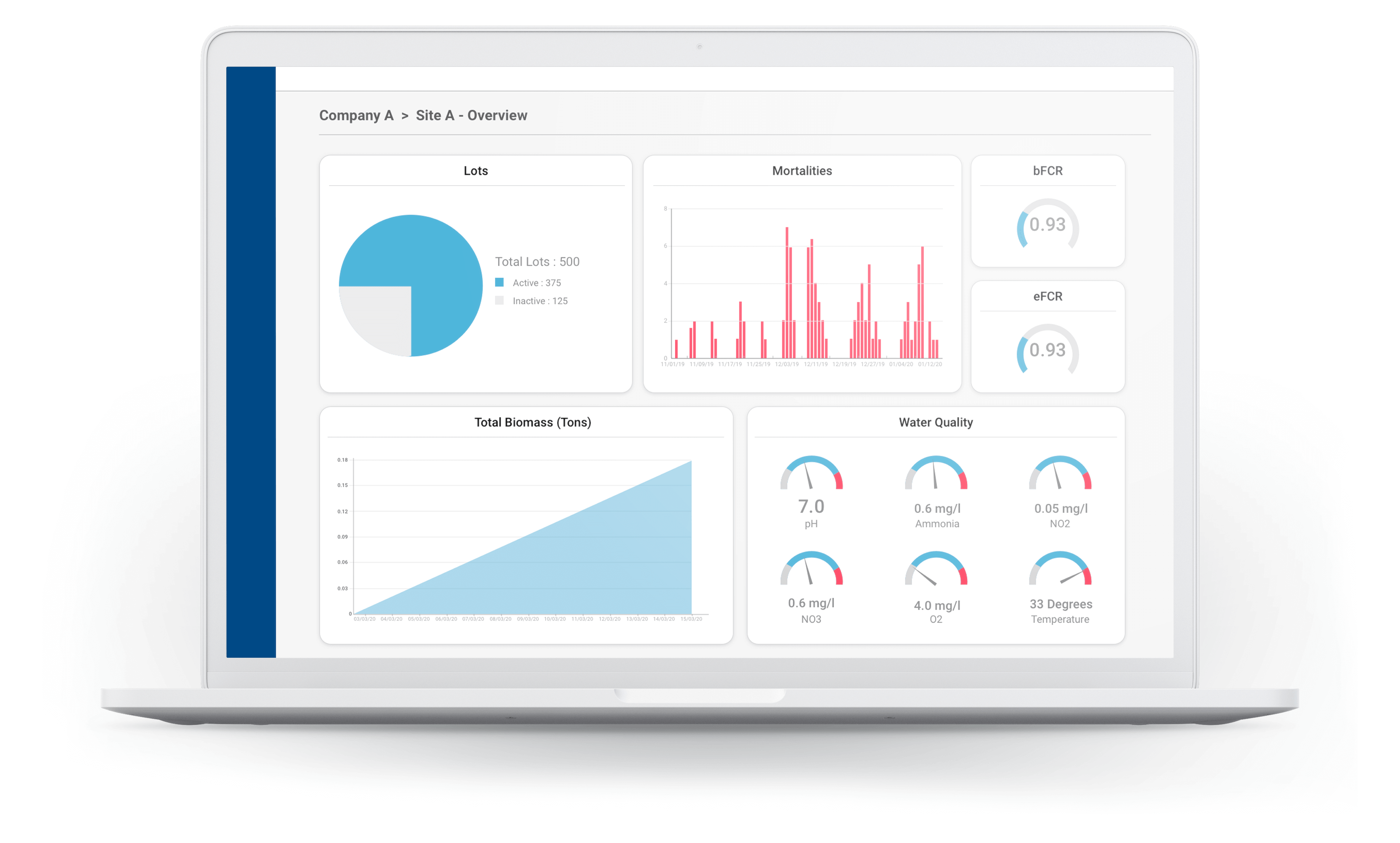
AquaOP Farm is a software platform developed by Wittaya Aqua to manage Aquaculture data. It is primarily being used by farm owners, managers, and field workers. The app itself has various functionalities including data entry, analysis, and tracking, but one of the most visually-appealing as well as challenging features we have designed and implemented is the Analytics Dashboard.
The Analytics Dashboard of AquaOP Farm is primarily there to give the user a bird’s eye view of their operations, and to answer the simple question: “How are things going?”.
The Challenge
Aquaculture operations generate a lot of data. There are hundreds of ways that we can display them. Therefore, it was important that we figure out what metrics are the most important to the users to see when they open up the software. It was apparent that this was a major pain point for many users who use our competitors’ software. Having too many metrics visible in the dashboard causes the users to get overwhelmed and become unable to see the data that really mattered. We had to find a solution to this problem.
This depended on the three types of users we identified as our target audience: The business owners, the site managers, and the field workers. From these three categories, the dashboard was mostly useful for the business owners and the site managers. Therefore, we decided not to add the analytics dashboard to the field workers' tier. For this example, I will be talking about the dashboard we created for the site managers.
The next challenge is to determine how to display them: Aka, what type of visualizations we should go for.
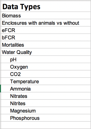
What data should we display?
We decided to do some user research to find out what they would like to see on their dashboards. For this, we conducted interviews and questionnaires online and gathered information from farmers from various backgrounds ranging from Asia to Latin America, from small entrepreneurs to multinational company owners. Finally, we decided to go with the most popular type of data requested and recorded during our surveys.
What type of visualizations should we go for?
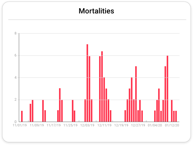
There were two major things to think about when deciding what type of visualizations we should go for: Familiarity and Intuition. There are some metrics such as Biomass and Mortalities that are already displayed in line, scatter, and bar charts when our users were using Excel Spreadsheets to record their data. We decided to keep these charts as they are so that there won’t be any learning curves involved with familiarizing themselves with our app and how things are done here.
Enclosures
Enclosures are also known as “Production lots” in aquaculture. For Enclosures, we went with pie charts. These show the number of available enclosures for stocking in a simple, easy-to-understand manner.
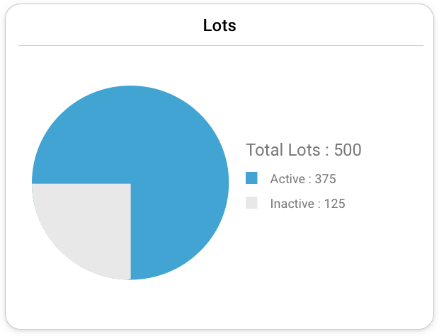
Enclosures
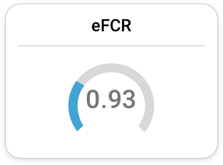
eFCR and bFCR have minimal and optimal values. Higher the value, the better it is. Therefore, we went with gauges. The lower the gauge value is, the more concerning it is.
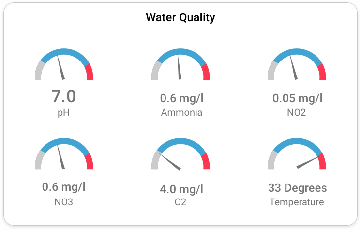
Water Quality
Water Quality also works in ranges, but going higher in value is not necessarily good for the animals like in the case of Feed Conversion Ratios. Therefore, we went with a variation of gauge graphs: Speedometers. Speedometers allow users to get an idea of when it’s “Too low” or “too high”, thus giving an at-a-glance view of when things are going bad.
The Conclusion
Our Data Analytics Dashboard was conceptualized and designed during the time of the Pandemic. As a result, our user research and requirement gathering had to be done online. Facebook and Whatsapp groups played a major role in this, connecting us with potential users worldwide.
As mentioned earlier, the requirements for this dashboard varies from user to user, thus we plan on offering more customizability in the future to ensure that our users see what they want to see, not what we think they want to see.
© 2021 Supul Amarakoon


