Aquafeed Ingredient Management Platform
Quick Overview
| What is it? | A tool to track, analyze, and manage raw materials used in Feed Production |
|---|---|
| Target Audience | Feed Manufacturers |
| Who worked with me? | 3 Developers + 2 Aquaculture Scientists |
| Interesting stuff I worked in | Data Visualization, Inventory Management Design, Data Entry Design, B2B applications |
AquaOP Feed Suite is a set of tools used by the aqua feed manufacturers to track their feed ingredients, formulate feed quantities, and price them according to their nutritional value. This design document will cover one of these tools in this suite, the Raw Material Map.
The Raw Material Map (or RMM) is used to store information about the feed ingredients (also called raw materials). This information includes their suppliers, batches, shipments, nutritional compositions, quality metrics, and past data.
When this tool was first conceptualized, it was intended to be a static sheet of data for a single client. However, upon realizing its potential, we decided to make it a dynamic application, allowing multiple feed manufacturers to use it.
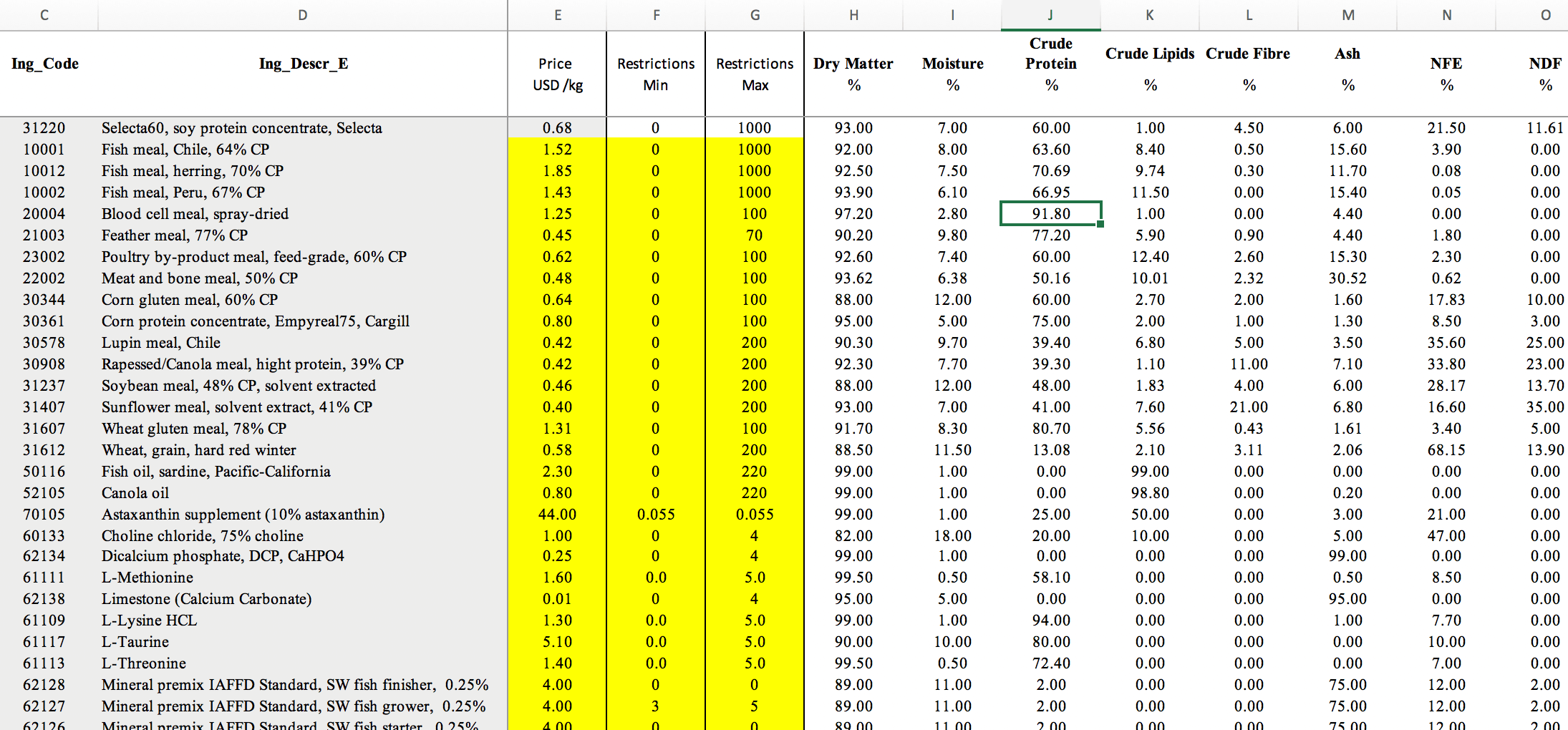
A Typical Feed Ingredient recording system
The Use Cases
This tool is primarily used by feed manufacturers to keep their feed ingredient information in one place. Based on the user personas we created, we came across the following four major use cases of RMM.
- Store and manage ingredient information
- Store and manage ingredient shipment and inventory information
- Store and manage supplier information
- Store and manage custom nutritional parameters
There were a few key pain points that we had to address based on these use cases and the user journeys we created.
- It’s hard to trace back to the origins of a good batch of ingredients/bad batch of ingredients.
- Some shipments contain multiple ingredients from multiple suppliers, and this wasn’t addressed properly.
- Some specific nutrients and quality parameters such as pigments are not available on Wittaya’s database.
The Design
We started creating the mockups for our software based on the research. We had to design the components based off of Vuetify.js (A Vue.js material design component framework) to keep the development times reasonable. As the lead designer, I went through the Vuetify library to determine which components fitour requirements the most.
Here are some of my favorite pages and the rationale behind their design.
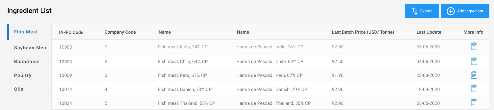
The ingredient List page
Most feed manufacturers use spreadsheets to store information about their raw materials. Our user research pointed to the fact that our users would be more comfortable with a similar format for this product as well. Therefore, we went with a simple tabular layout for our ingredient list page. We divided our ingredients into sub categories in order to make it easier for the user to search for a particular ingredient.
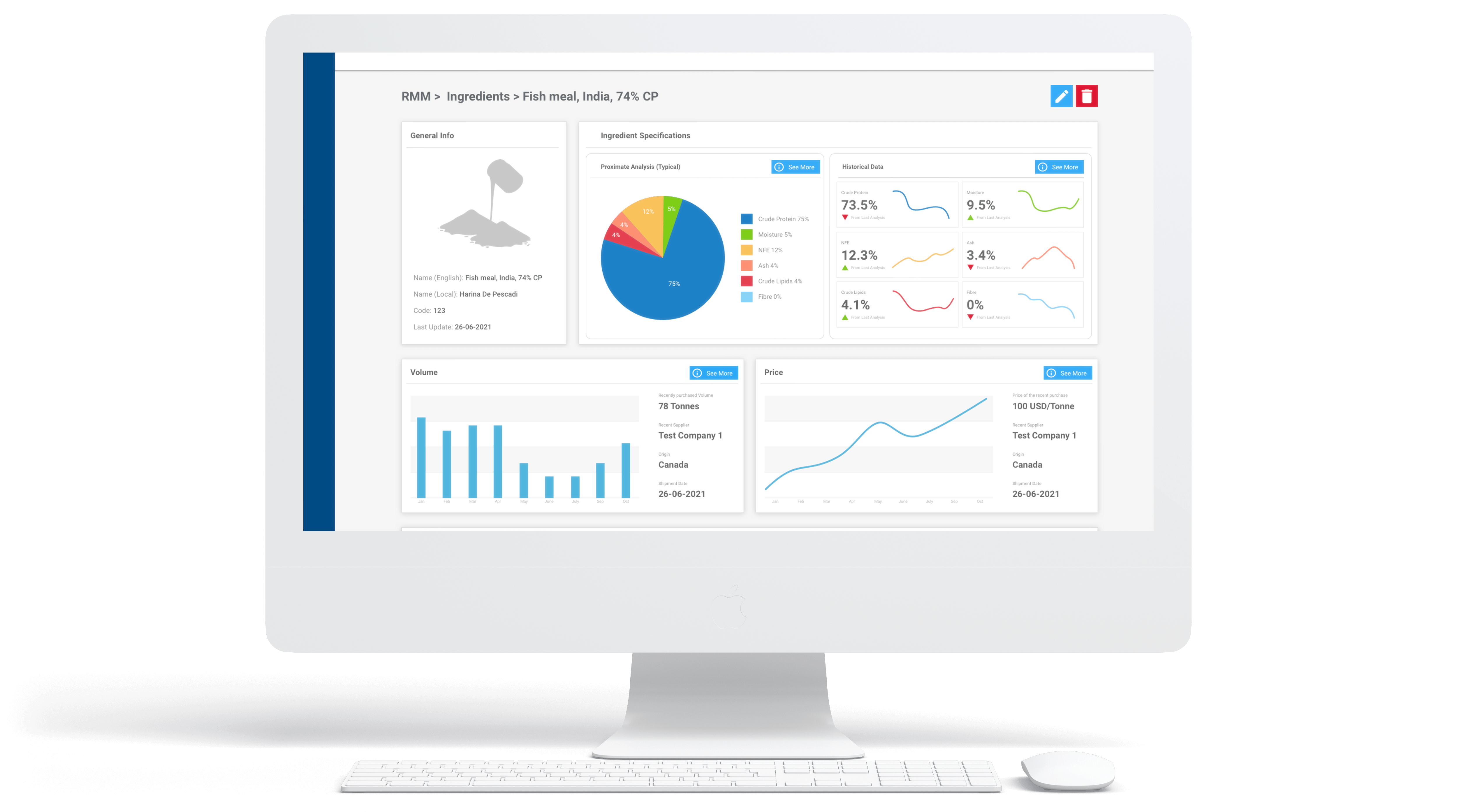
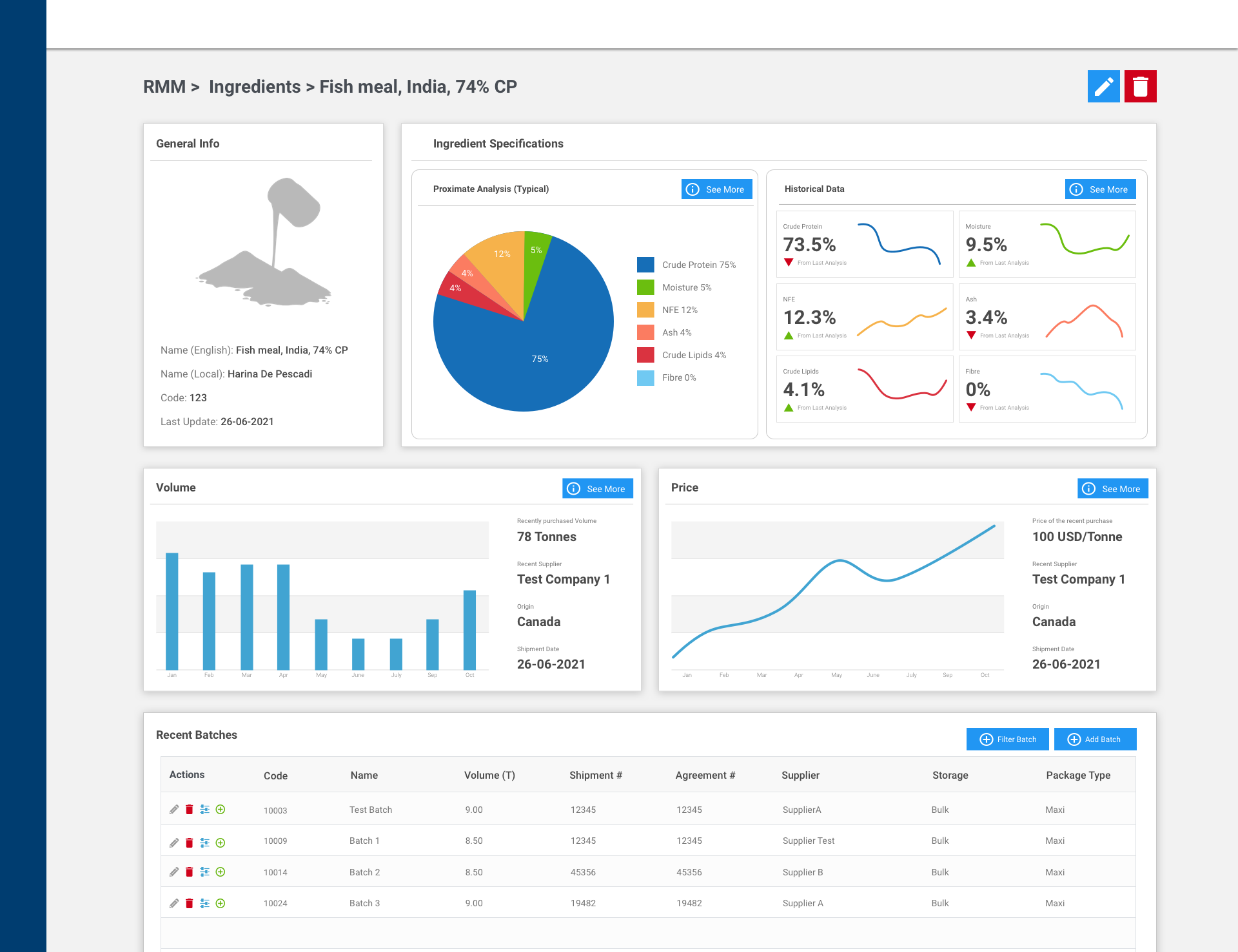
Ingredient Details page
Next, we have our Ingredient Details page. This is accessed by clicking on the “More Info” button on an ingredient in the table. This page acts as a hub, providing details about the ingredient including its general information, nutritional information, volume and pricing information, as well as batch information.
These are presented in a dashboard-like interface for a quick overview of the ingredient itself.
There is a considerable amount of information about ingredients recorded in RMM. As a result, the page can get quite crowded and difficult to follow. As a solution, I chose a card-based approach, grouping similar information into sections.
The Shipment Page
A shipment refers to a truck full of ingredients delivered to the feed manufacturer. This shipment may contain multiple ingredients coming from multiple suppliers.
A specific ingredient being delivered from a specific supplier in a shipment is referred to as a batch.
Therefore, an easier way to understand how shipments work would be to say that a Shipment contains multiple batches. Thus, we needed a page to record these shipments and the batches belonging to that shipment.
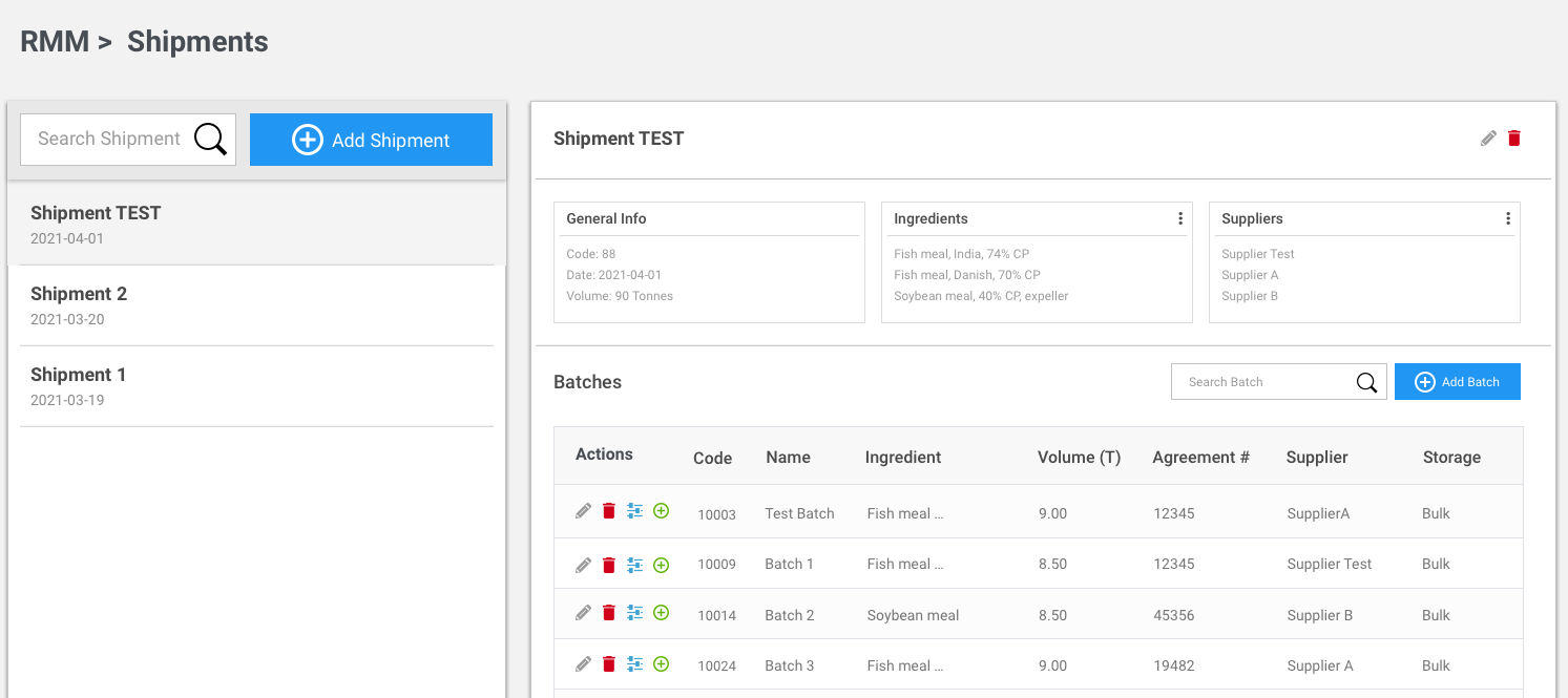
Our shipment page is divided into two parts. The left card lists down all the shipments with a search bar to search for a shipment and a button to add a shipment. On the right side, we display shipment details and the batches that came along in the shipment. We also allow the user to add a batch on this card.
Visual design
Due to the scope of the planned features and constraints on the delivery time, we did not plan to add any custom styling to this project. However, we tried to maintain the brand identity through the usage of colors (i.e, the call-to-action buttons, form components, etc.). Rest of the styling was defaults from Vuetify. Even when I was creating mockups, I did my best to use the fonts and colors consistently to ensure that I make them look as close as I can to the final product.
Prototyping
Figma was used as our key prototyping and collaboration tool in showing the design to the client for feedback. We trained the members of the science team to edit the values on the mockups to ensure that the clients see realistic values on the tables.
Conclusion
Aquafeed production is not an industry that I was familiar with. As a result, I worked with a lot of Aquaculture nutritionists to come up with the design.
It was rewarding to learn how aqua-feed is manufactured and how much thought is put into it. It made me appreciate the seafood I eat a bit more and gave me a great experience in designing a web application for a subject that I am not too familiar with.
© 2021 Supul Amarakoon


